Wolfsbane
Wolfsbane Vodka
The first output from the newly minted Wolfsbane stills was a pair of outstanding Vodkas, pitched at the standard & premium classes.
We wanted them to stand apart from all other vodkas whilst reflecting a very high quality value & feel.
These releases mark the beginning of what is shaping up to be a dynamic and growing collection of handcrafted spirits, with several additional products already in development.
Skål!
The Brief
Building on the established Wolfsbane brand, Flametree developed packaging for the distillery’s first spirit releases, a pair of vodkas positioned in standard and premium categories. The design approach combined the now-familiar wolf imagery with delicate illustrations of the Wolfsbane plant’s distinctive flowers, creating a visual language that felt both connected to the brand and distinctive on shelf.
To elevate the presentation, we used a prismatic clear and opaque label combination. This approach introduced depth and movement to the design, delivering a premium graphic finish while remaining consistent with the broader Wolfsbane identity.
The result is a pair of bottles that stand confidently alongside the best designs in the category. The standard vodka is intended to become the house pour once the Wolfsbane bar opens, offering excellent value, while the premium expression sits above it as a more refined option within the range.
See similar projects
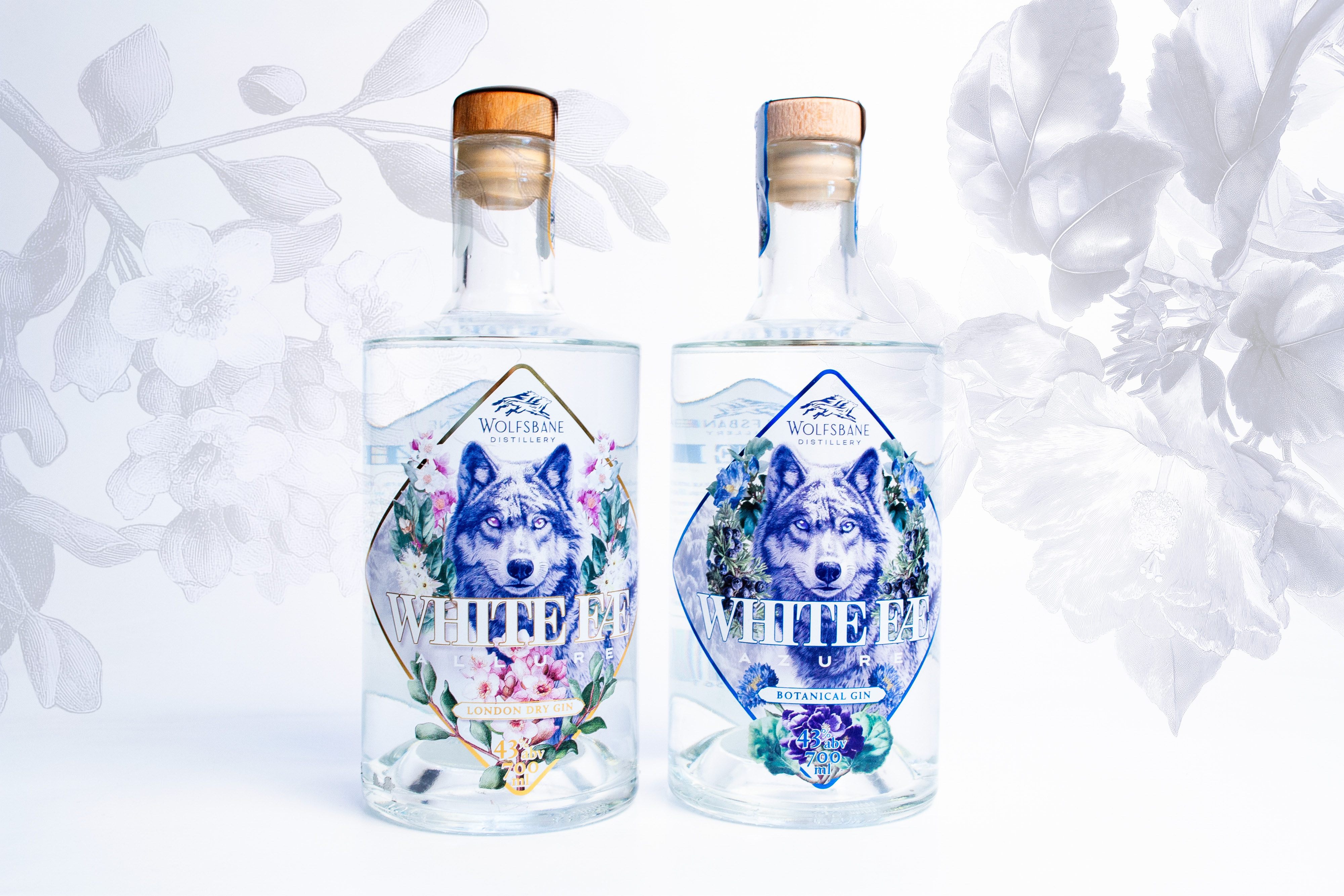
Wolfsbane White Fae
As part of the new Wolfsbane core range, we needed to package two high-end gins fresh from the Wolf lab. The boys behind the brand conjured up a London Dry & a Botanical offering.
The London Dry Gin label has won gold in the recent 2025 Proof Awards Design category.
Cin-cin!

Wolfsbane Limoncello
As part of their initial core offering, Wolfsbane Distillery have brewed up a classic Italian favourite Limoncello.
The elegant bottle was graphically challenging, but we managed to create a design that emphasised the shape & gave great shelf presence. The Wolfsbane Limoncello has already won an International taste award & we managed a gold for the packaging design.
Bellisimo!

Billy Gin Tins
Our friends at Billy Stitch Distillery have been busy concocting some delicious new pre-mixed drinks to put into tins and unleash onto the gin loving public.
We'd love to work with you
There's not much we don't know about creating and promoting brands. Contact us today to discover how we can help grow your business.